Coldwater Creek | Event In A Box Campaign

COLDWATER CREEK

EVENT-IN-A-BOX CAMPAIGN

digital  |  signage  |  print

Challenge & Opportunity

To drive foot traffic to retail locations, Coldwater Creek launched a localized experiential marketing initiative: hosted in-store events with exclusive incentives (e.g., gift items, store discounts, and co-branding opportunities for local hosts). With each retail store tasked to execute two events per month, the core creative challenge was to design an efficient, scalable marketing system that maintained brand standards while allowing rapid customization for localized print and digital promotion.

Strategic & Creative Leadership

Created a scalable, cohesive suite of templates for physical (in-store collateral, direct mail) and digital touchpoints (email blasts, social media assets) to ensure nationwide brand consistency. Store teams could quickly plug in custom host details as event requests were finalized.

Business Impact & Strategic Value

Powered nationwide execution across the entire store footprint, supporting a target cadence of two localized events per month per store without creating creative production bottlenecks. Blended digital outreach with physical, high-touch store experiences to increase local customer acquisition and overall store traffic.


My roles: Concept, Design, and Production


Peer landscape & Concept presentation

I researched other retailer’s in-store event collateral. Coldwater Creek’s campaign needed to continue the brand story while having a uniqueness that would stand out from the current in-store signage.


Final Email & Facebook Invitations


In-Store Signage


Printed Direct Mail, Gift Cards, and Handouts


Collette | map design & travel itineraries

COLLETTE

MAP DESIGN & TRAVEL ITINERARIES

concepts | collateral | digital  |  print


Challenge & Opportunity

Collette, a global leader in guided travel, required senior creative direction to market an expansive portfolio of tours. They range from classic group itineraries and river cruises, to niche faith journeys and private tours. The strategic objective was to articulate the distinct value of each travel category while maintaining a cohesive, high-touch brand identity that inspired booking confidence and resonated across diverse traveler demographics.

Strategic & Creative Leadership

Concepted and designed marketing assets across Collette’s varied tour verticals, creating visual hierarchies that clarified differences in group size, travel style, and destination depth. Elevated campaign imagery and editorial layouts to highlight Collette’s core brand pillars: transformational guest experiences, community impact, and hassle-free worldwide travel. Standardized art direction across print brochures, digital campaign assets, and promotional collateral to ensure seamless visual pacing across customer discovery channels.

Business Impact & Strategic Value

Streamlined visual navigation across complex tour offerings, helping prospective travelers evaluate and select travel styles faster. Reinforced Collette’s premium market standing by blending high-impact photography with an intentional narrative feel.

My role: Concept, Design, Production (used specialized software to design map itinerary).
Additional Team Collaborators: Copy, Marketing, and Production Manager.


Tour Map Design

Visualizing complex, multi-stop itineraries across Collette’s 200+ global tours required a standardized mapping system that delivered geographic precision while functioning seamlessly across both digital and print touchpoints. Using special software, I create a scalable, multi-purpose map for every tour that served as an intuitive navigation tool for travelers, and a foundational design asset across marketing channels. I managed annual updates and production execution for 200+ custom tour maps, drastically reducing cross-channel design overhead.


Digital Tour Itinerary

When travelers selected an itinerary on Collette’s website, they needed a cohesive, professional printout to serve as a tangible reference. The objective was to design a standardized digital-to-print template. It summarized trip details, included branded elements, tour naming, pricing, location photography, general experience copy, detailed daily itineraries, and custom maps, into an elegant document that maintained brand integrity across all home-printed assets.


Tour Brochure Design

Tour brochures were printed in multiple sizes and frequently used by travel agents.


Group Travel Planner

Travel professionals rely on Collette’s annual Travel Planner as a primary sales enablement tool to review and book client travel. The strategic challenge was to update this B2B resource, incorporating new destination photography, evolving travel guidelines and planning tools. It streamlined workflow for external advisors while reinforcing Collette’s premium brand positioning.

CoCollSave

Save

Save

Save

Save

Save

J.L. Powell | Endangered Species Campaign

J.L. POWELL

ENDANGERED SPECIES DIGITAL & PRINT CAMPAIGN

concepts  |  print  |  digital


Challenge & Opportunity

J.L. Powell (later becoming “True Measure of a Man”), a high-end men’s apparel and accessory brand catering to affluent, sports-minded consumers (average age 60, household income $200k+). The customer required an integrated visual strategy for its annual “Endangered Species Sale.” The primary objective was to drive high-volume inventory clearance across print and digital channels while maintaining the brand’s luxury, bespoke positioning and strictly adhering to unique customer preferences, such as headless model framing.

Strategic & Creative Leadership

Cross-Channel Campaign Conception:
Led the end-to-end creative direction for the annual sale event, managing merchandise layout, visual storytelling, and strategic SKU placement across print catalogs and digital channels. Referenced demographic insights to visual execution, maintaining the brand’s signature headless model art direction to align with customer response data and preserve brand trust.

End-to-End Print Operations:
Designed, produced, and prepped seasonal and Endangered Species catalog and Clearance inserts. Handled color retouching and direct press proof approvals with the printer to ensure flawless production quality.

Digital Ecosystem Execution:
Created supporting e-commerce assets, including landing pages, hero banners, product thumbnails, and category header graphics to create a seamless print-to-digital promotional experience.

Business Impact & Strategic Value

Accelerated seasonal inventory clearance across luxury apparel and high-ticket technical gear without diluting brand equity. Unified print and digital touchpoints to capture maximum share of wallet from a high-net-worth customer segment during a key revenue window.

My Role: Concept, Art Direction, Production, Vendor Management
Team Collaboration: Partner directly with CEO and Creative Director, Merchandiser


Dotcom Campaign Elements: Homepages, Product Thumbnails, Category Headers


Print Campaign Elements: Concepted & Designed Catalog Spreads with Clearance Insert


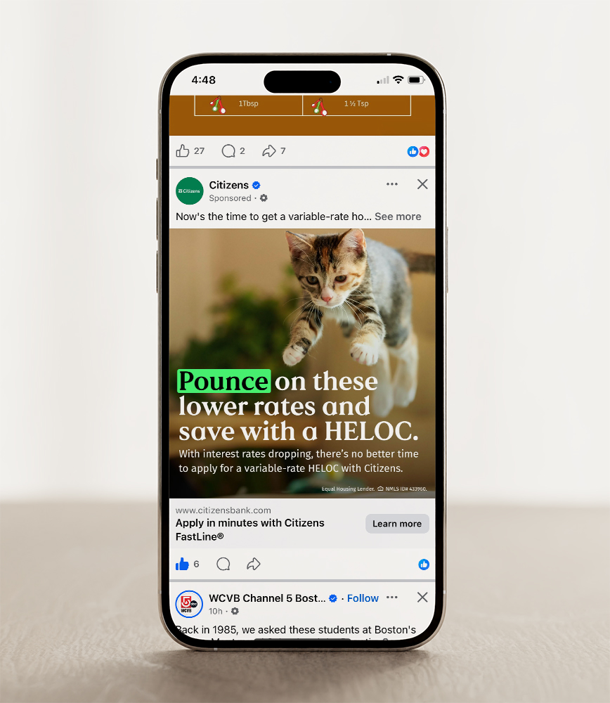
Citizens | Digital HELOC Campaign

Citizens

DIGITAL HELOC CAMPAIGN

concept  |  branding  |  social + digital media


My Roles: Concept, Design, Social Animation, and Production
Collaboration with Lead Copywriter: Mike Santopietro

Challenge & Opportunity

Citizens launched a digital acquisition campaign targeting homeowners (ages 35+) with strong credit and borrowable equity to drive Home Equity Line of Credit (HELOC) originations. The primary obstacle was consumer friction around interest rate volatility, closing fees, and information overload. A creative challenge given was to develop attention-grabbing visuals, through eye-catching imagery, design, or copy that’s fun, interesting, or unexpected.

Partnering with a lead Copywriter, we developed a performance-driven paid media campaign that positioned Citizens HELOC (and its Citizens FastLine) as the smartest, fastest, and most cost-effective way to fund major life goals.

Strategy & Leadership

With a Copywriter, simplified complex financial concept such as rate drops, lowered promotional interest rates, and zero closing costs into bite-sized, high-converting creative concepts. Designed, animated, and produced a campaign of paid digital assets, including animated Meta/Instagram Stories, Reddit, Meta static and animated posts, and multi-size display banners.

Pushed visual and conceptual boundaries utilizing eye-catching motion design, dynamic typography, and a bold layouts to break through social media feed clutter while maintaining financial compliance and brand integrity.

Business Impact & Strategic Value

Targeted high-intent borrowers likely to draw balances within 90 days, fueling long-term customer lifetime value and cross-sell potential across Citizens’ portfolio. The journey from digital media takes the viewer to learn more and apply for a HELOC using Citizens Fastline.


Animated Social Post
click image to view

Animated Social Post
click to view


Marshalls | Art Direction

To support Marshalls’ nationwide seasonal marketing campaigns, high-volume visual assets were required for in-store signage and regional advertising. The core objective was to direct large-scale, multi-day location photoshoots that captured authentic, high-energy lifestyle imagery across diverse visual touchpoints.

Strategic & Creative Leadership

Led pre-production planning and on-location as well as studion execution, overseeing full creative and technical crews to align multi-day shoots with campaign goals.
Managed the budget, casting and crew assembly, recruiting photographers, stylists, models, and location scouts to build a cohesive visual narrative. Executed real-time creative decision-making on location, guiding lighting, composition, wardrobe styling. Delivered a visual library prepped for large-format in-store signage and multi-channel advertising campaigns nationwide. Elevated the customer shopping experience through high-impact, aspirational visual storytelling that reinforced Marshalls’ value proposition at the point of purchase.

Chadwicks | logo concept & design development

CHADWICKS

BRAND STRATEGY & DEVELOPMENT, LOGO DESIGN

concept  |  branding  |  print  | digital  |  art direction  |  collateral


Challenge & Opportunity

Chadwick’s, a legacy catalog brand known for classic casual and career womenswear, sought to reposition itself to appeal to a younger, 30+ yr old demographic while retaining its core 50+ yr old customer base. The strategic challenge was to execute a comprehensive brand evolution with a modernized logo redesign that signaled a fresh, sophisticated, and updated classic look across all apparel, print, and digital touchpoints.

Strategic & Creative Leadership

Redesigned the primary Chadwick’s logo to reflect an updated, sophisticated aesthetic, which included a strategic orthographic shift (removing the apostrophe to create a modern, streamlined visual mark – which eventually came back).

Partnered directly with a lead copywriter to overhaul the brand’s verbal and visual tone across all customer-facing channels, ensuring seamless integration between design and messaging.

Rolled out the refreshed visual identity across high-density catalog covers, editorial spreads, e-commerce assets, and promotional collateral.

Business Impact & Strategic Value

Positioned the brand to successfully attract a younger female shopper without alienating the established customer base.

Re-energized the entire brand presence, establishing a contemporary, cohesive visual language across both print and digital touchpoints.

My role: Concept, Art Director, Design, Production
Team collaborators: Creative Director, Copywriter, Merchandise team


Peer Landscape & Initial Ideas

Background research on brands that have the same values. These brands also represent the Chadwick’s customer we wanted to attract.


Before & After – Final Logo


Catalog Covers


I art-directed the photoshoots and designed the promotional type treatments to accompany the rollout of the new logo.


Email & Website Header


Branded Elements

I designed the apparel labels and gift boxes, concepted & executed marketing campaigns with a Copywriter.


Pythia Analytics | branding development & design


PYTHIA ANALYTICS, LLC.

BRAND DEVELOPMENT & IMPLEMENTATION

concept  |  branding  |  art direction  |  digital  |  print  |  collateral


Challenge & Opportunity

As a direct-to-consumer data intelligence startup targeting small-to-medium catalog and e-commerce brands, Pythia Analytics needed complete brand creation and creative direction. The strategic challenge was to position Pythia’s suite of services; database marketing, data modeling, merge services, and an interactive customer portal, as an accessible, high-value alternative to legacy enterprise data providers.

Strategic & Creative Leadership

Sole creative lead, concepting and designing visual execution, vendor management, and production for all physical and digital brand touchpoints. The brand identity and design established visual authority in the fintech and data intelligence space. Translated Pythia’s complex technical capabilities into a streamlined framework tailored to mid-market catalog and direct-to-consumer decision-makers. Collaborated on the interface design for their core differentiator: an interactive customer portal that enabled clients to manage campaigns, submit data, and generate real-time analytics reports.

Business Impact & Strategic Value

Delivered a end-to-end brand identity and digital platform interface that allowed Pythia to launch into an underserved mid-market niche with immediate credibility. Built a complete, scalable creative framework that supported vendor partnerships, direct sales enablement, and platform user adoption.

My role: Strategy, Concept, Art Direction, Design, Production, Vendor Management
Collaborator: Principal/CEO


Concepting & Initial Logo Presentation

Initially, the company name held personal significance only to the Principal rather than serving as a key brand differentiator. To stand out against established competitors like Clario, Tricision, Web Decisions, Datamann, and InfoGroup, the core identity needed to bridge the historical origin of the name, referencing the priestess of the Oracle at Delphi, with Pythia’s modern data intelligence capabilities.

Initiated the creative process with raw pencil-and-paper exploration, grounding the visual identity in historical research to turn a unique name into a compelling selling feature. Strategic discovery established three core brand pillars, Connectivity, Growth, and Intelligence, tying the vision of the ancient oracle directly to Pythia’s data modeling capabilities.

Transformed an obscure company name into an authoritative market identity that visually and narrative-wise outpositioned mid-market competitors.


Final Logo with Color Options


Website

The website functioned as a marketing tool to use during initial conversations with potential clients. There was also Client Portal Login which would bring a client to a password protected server. I intentionally kept the photography black and white. It relates back to a digital connection, the rawness of data and spreadsheets. It also supports the importance of the copy, doesn’t distract from it.


Branded Elements: business cards, letterhead, excel spreadsheets, invoices

The Principal/CEO loved the choice of having two different colored business cards. The green logo was used mostly on the Client Server. They were printed on 32 pt stock, so it would really pop out from the competition. Other elements included letterhead, invoices, and excel spreadsheets.