Wayfair | Kitchen & Dining Catalog Design

Wayfair

Kitchen & Dining Catalog

concepts  |  branding  |  print 


Wayfair is customer-focused. The customer has been on the Wayfair website searching a specific category. They didn’t convert to a purchase. This category-specific catalog will arrive at the customers home to remind them of their search. Partnering with marketing and merchandising, we do a deeper dive into the category. We address needs of the customer – in value, selection, style, and tools to choose the right product to make their house a home.


An edited selection of Kitchen & Dining Catalog spreads.


OPCO | brand development & design

OPCO

BRAND DEVELOPMENT & IMPLEMENTATION

concepts  |  branding  |  digital  |  print  |  collateral


Operating Partners Collective (OPCO) is a network of financial executives with expertise spanning strategy, operations,
product and business development. Their niche is primarily capital markets services, technology, and infrastructure.

The executives had a brand development need based off an initial logo.
I clearly defined their brand, as “Catalyzing Outcomes,” which articulates their niche in the industry.
The strategy was rolled out across print and digital components.

A few key words which make OPCO stand out:
execution/implementation, outcomes, success, focused (capital markets)


Concept Presentation

Concept A: “Catalyzing Outcomes” is unique to OPCO’s brand positioning. I introduced the ascending line to show the acceleration, growth, and outcomes OPCO brings its’ clients. The ascension gives OPCO an advantage rather than using a ‘flat’ or horizontal line.

The ascending line is different and shakes up the traditional. It creates a “bridge” between the traditional and the new/younger companies.

Concept B: This concept with the linking ‘O’s represents the implementation, execution, engagement, relationships, and bandwidth that enables OPCO to stand out from other consultants and boutique agencies. The linking ‘O’s also speak to OPCO’s industry focus.

Concept C: As mentioned in the first option, “Catalyzing Outcomes” is unique to OPCO’s brand positioning. These lines however, show accelerated/catalyzing outcomes using two vertical ascending lines. A different execution to show a similar concept. This also ‘stands up a client’ and allows you to keep in touch – from the start of your relationship. Slightly more ‘traditional’ or ‘expected’ than the Concept A, but still different.


Final Branded Elements: Business Cards, Letterhead, Proposal Template


Final Branded Elements: Powerpoint Pitch Deck


Final Branded Elements: Style Guide

Picturia Press | Bushboys Book Design

PICTURIA PRESS

BUSHBOYS BOOK DESIGN

concepts  |  book design  |  print 


Picturia Press is a boutique agency specializing in bespoke creative and storytelling projects.
As a freelance assignment for Picturia Press, I designed a 146-page book for an Australian soccer team – the Bushboys.
Using an established brand identity, I designed every spread to tell a story as exciting, hard-hitting,
and masculine as the Bushboys.


Book Design


Coldwater Creek | Concepts & Design

COLDWATER CREEK

CONCEPTS & DESIGN

concepts  |  branding  |  print 


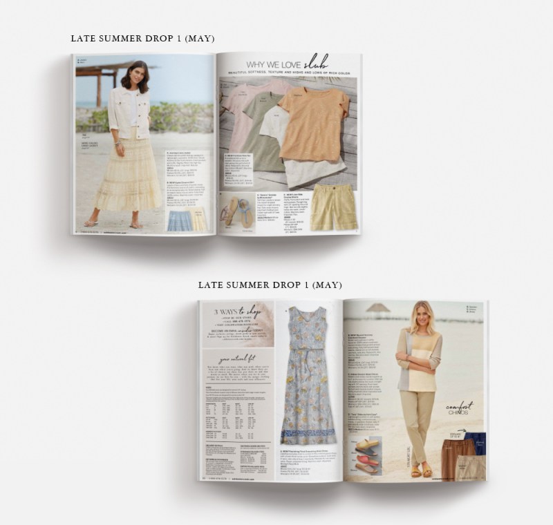
There are many times when my role is not to tell an entire brand story, but just a chapter of it. Coldwater Creek appreciated my expert knowledge of catalog conception and design. Having a full understanding of their brand refresh and their customer, challenged me with creating impactful product presentations to trigger customer engagement. I had so much fun partnering with copywriters, art directors, production, and the merchandise team to elevate the brand.


An edited collection of printed catalog presentations I designed for Coldwater Creek.


Coldwater Creek | Cardigan Concept Presentation

COLDWATER CREEK

CARDIGAN CONCEPT PRESENTATION

concepts  |  branding  |  print


The cardigan was forecasted to be one of the top 5 items sold in the spring/summer season. The customer could also purchase the matching shell with it. Historically, it had sold very well when it had its own spread in a catalog. I was challenged to tell a new story for the cardigan through the spring and summer season catalogs that married to the brands’ creative refresh.


Merchandise to be on Catalog Spread & Seasonal Inspiration


Cardigan Concept Presentation

The detailing and colors of the pointelle cardigans – the beautiful slub yarn and coconut shell buttons was a uniqueness the customer looked for. I wanted her to buy it with a matching shell – her behavior was to purchase matching items. My presentations showed optional head-to-toe outfitting ideas for the cardigan and shell. Showing the customer what to wear the cardigan with, and how to accessorize would get her excited. For copy, adding a customer testimonial always built in confidence. Collaborated with a copywriter to further support the story.


Final Printed Cardigan Presentations

Despite the positive internal review of many of these concepts, the cardigan and shell story were strong enough to stand on their own. The close up detailing of the hero shots drove home the quality and uniqueness that she was looking for.


Coldwater Creek | Tee Concept Presentation

COLDWATER CREEK

TEE CONCEPT PRESENTATION

concepts  |  branding  |  print 


The slub tees were forcasted to be the top performer on the spread for a summer catalog. I had no previous performance information on this new item. My challenge was to create an inspiring story which tied back in to the brand refresh.


Merchandise to be on Catalog Spread & Seasonal Inspiration


Tee Concept Presentations

I always want the customer (her) to be able to see the quality and uniqueness of the merchandise. That supports Coldwater Creeks brand essence. The headline/subhead enhance the story. The shorts help tell a wardrobing story of an entire outfit she could purchase.


Final Printed Tee Presentation

The headline and subhead for the tees supports what may be difficult to see in the photography (the slub). The original merchandised spread was split to tell a more balanced story. The tees continue to be the most important item on the spread. However, it overall feels more seasonally appropriate, and you can see how the tee can be layered under a jacket as well.


Coldwater Creek | Event In A Box Campaign

COLDWATER CREEK

EVENT IN A BOX CAMPAIGN

digital  |  signage  |  print  |  collateral


Coldwater Creek was challenged to bring additional foot traffic into their stores. One solution was to have hosted events at the store. There were incentives for hosting a party, such as receiving a shirt and getting a store discount. The host could promote their own product, or just have a night out with multiple friends. Each store was asked to host 2 events a month.

My role was to create seasonal campaign templates for print and digital media. The host’s information could be plugged in as soon as the event request came in.


Research & Concept Presentation

I researched other retailers to see their in-store event collateral. Coldwater Creek’s campaign needed to continue the brand story while having a uniqueness that would stand out from the current in-store signage.


Final Email & Facebook Invitations


In-Store Signage


Printed Direct Mail, Gift Cards, and Handouts


Collette | map design & travel itineraries

COLLETTE

MAP DESIGN & TRAVEL ITINERARIES

concepts | collateral | digital  |  print


Collette is a travel company focused on delivering extraordinary worldwide travel experiences that enhance the lives of their guests and enrich communities where they give back. The Collette team creates several types of group tours their travelers can choose from. Classic tours, small group explorations, city stays, river cruises, faith journeys, and also private tours.


Tour Map Design

The main focus of my work with Collette has been designing a tour map for every tour they offer (the tours are updated yearly, and yes, there are a lot). I use mapping software in order to create accurate tour maps for the travelers. As I design the maps, I keep in mind that they will be used digitally (ie: landing page), as well as in print (ie: yearly Travel Guide). When the maps are finalized, I ensure they fit the needs of at least six different types of projects. They are an excellent visual aid for the traveler.


Digital Tour Itinerary

Once a traveler chooses an itinerary online, they are able to print it out. My challenge was to create a template which included a ‘letterhead’, tour name, pricing, photos of the location, general experience information, and then a detailed written itinerary with tour map (which I also designed).

The final template is a beautiful tour takeaway that stays true to Collette’s brand standards.


Tour Brochure Design

Tour brochures were printed in multiple sizes and frequently used by travel agents.


Group Travel Planner

The Travel Planner is a tool used by travel professionals complete with marketing information and helpful tools to use in planning. This yearly planner was updated with new photography and travel guidelines specific to Collette travelers.

CoCollSave

Save

Save

Save

Save

Save

J.L. Powell | Endangered Species Campaign

J.L. POWELL

ENDANGERED SPECIES DIGITAL & PRINT CAMPAIGN

concepts  |  print  |  digital


J.L. Powell was a luxury men’s apparel and accessory brand with a catalog and online presence. The average male customer age was 60 with an income of $200+. With a sporting lifestyle, he looked to J.L. Powell for handmade, one-of-a-kind technical and tactical items.

The Endangered Species Sale was an annual sale across both digital and print touchpoints. I concepted (including merchandise placement), designed, and produced the Endangered Species Sale catalog and Clearance insert. I also prepped the catalog and insert for printing, complete with retouching, and approved the online dbls with the printer.

For the digital channel – I developed the campaign of homepages, product thumbnails, and category headers to support the sale. Fun fact: The J.L. Powell customer did not respond to seeing faces on the models – so model shots were always cropped.


Digital Campaign Elements: Homepages, Product Thumbnails, Category Headers


Print Campaign Elements: Concepted & Designed Catalog Spreads with Clearance Insert


boston design studio | branding & design

BOSTON DESIGN STUDIO

BRANDING & DESIGN

concepts  | branding  | art direction  |  print 


The Chadwick’s brand designed their own apparel. They also created a specialty sub-collection, Boston Design Studio (also relating to being owned by Boston Apparel Group). Boston Design Studio’s collection was designed to attract a younger customer – being sophisticated and fresh with modern details.

I designed the logo to draw off of the Boston Apparel Group logo. It would only be seen knocked-out of black. It appeared as apparel labels and also in the printed catalogs.


Logo shown in printed catalog spreads