Wayfair | Kitchen & Dining Catalog Design

Wayfair

Kitchen & Dining Catalog

concepts  |  branding  |  print 


Wayfair is customer-focused. The customer has been on the Wayfair website searching a specific category. They didn’t convert to a purchase. This category-specific catalog will arrive at the customers home to remind them of their search. Partnering with marketing and merchandising, we do a deeper dive into the category. We address needs of the customer – in value, selection, style, and tools to choose the right product to make their house a home.


An edited selection of Kitchen & Dining Catalog spreads.


OPCO | brand development & design

OPCO

BRAND DEVELOPMENT & IMPLEMENTATION

concepts  |  branding  |  digital  |  print  |  collateral


Operating Partners Collective (OPCO) is a network of financial executives with expertise spanning strategy, operations,
product and business development. Their niche is primarily capital markets services, technology, and infrastructure.

The executives had a brand development need based off an initial logo.
I clearly defined their brand, as “Catalyzing Outcomes,” which articulates their niche in the industry.
The strategy was rolled out across print and digital components.

A few key words which make OPCO stand out:
execution/implementation, outcomes, success, focused (capital markets)


Concept Presentation

Concept A: “Catalyzing Outcomes” is unique to OPCO’s brand positioning. I introduced the ascending line to show the acceleration, growth, and outcomes OPCO brings its’ clients. The ascension gives OPCO an advantage rather than using a ‘flat’ or horizontal line.

The ascending line is different and shakes up the traditional. It creates a “bridge” between the traditional and the new/younger companies.

Concept B: This concept with the linking ‘O’s represents the implementation, execution, engagement, relationships, and bandwidth that enables OPCO to stand out from other consultants and boutique agencies. The linking ‘O’s also speak to OPCO’s industry focus.

Concept C: As mentioned in the first option, “Catalyzing Outcomes” is unique to OPCO’s brand positioning. These lines however, show accelerated/catalyzing outcomes using two vertical ascending lines. A different execution to show a similar concept. This also ‘stands up a client’ and allows you to keep in touch – from the start of your relationship. Slightly more ‘traditional’ or ‘expected’ than the Concept A, but still different.


Final Branded Elements: Business Cards, Letterhead, Proposal Template


Final Branded Elements: Powerpoint Pitch Deck


Final Branded Elements: Style Guide

Medifor | Brand Strategy & Creative Direction

Medifor

BRAND STRATEGY & CREATIVE DIRECTION

strategy | concepts


Medifor is a start-up e-commerce B2B company selling medical supplies. As Brand Consultant, I lead Medifor’s team to better align their brand strategy prior to launch. This included a focused mission & value statement, purpose, B2B customer and who they serve, as well as the company name. Also consulted on the creative direction of the branding across all touchpoints with customer.


Medifor e-commerce site


Coldwater Creek | Concepts & Design

COLDWATER CREEK

CONCEPTS & DESIGN

concepts  |  branding  |  print 


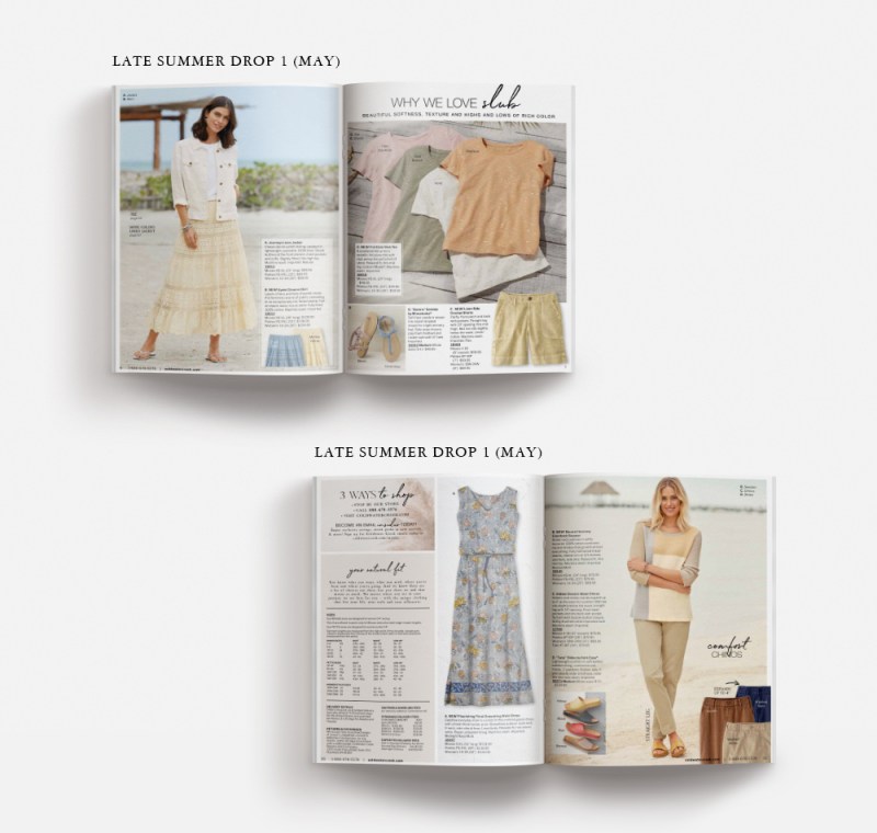
There are many times when my role is not to tell an entire brand story, but just a chapter of it. Coldwater Creek appreciated my expert knowledge of catalog conception and design. Having a full understanding of their brand refresh and their customer, challenged me with creating impactful product presentations to trigger customer engagement. I had so much fun partnering with copywriters, art directors, production, and the merchandise team to elevate the brand.


An edited collection of printed catalog presentations I designed for Coldwater Creek.


Coldwater Creek | Cardigan Concept Presentation

COLDWATER CREEK

CARDIGAN CONCEPT PRESENTATION

concepts  |  branding  |  print


The cardigan was forecasted to be one of the top 5 items sold in the spring/summer season. The customer could also purchase the matching shell with it. Historically, it had sold very well when it had its own spread in a catalog. I was challenged to tell a new story for the cardigan through the spring and summer season catalogs that married to the brands’ creative refresh.


Merchandise to be on Catalog Spread & Seasonal Inspiration


Cardigan Concept Presentation

The detailing and colors of the pointelle cardigans – the beautiful slub yarn and coconut shell buttons was a uniqueness the customer looked for. I wanted her to buy it with a matching shell – her behavior was to purchase matching items. My presentations showed optional head-to-toe outfitting ideas for the cardigan and shell. Showing the customer what to wear the cardigan with, and how to accessorize would get her excited. For copy, adding a customer testimonial always built in confidence. Collaborated with a copywriter to further support the story.


Final Printed Cardigan Presentations

Despite the positive internal review of many of these concepts, the cardigan and shell story were strong enough to stand on their own. The close up detailing of the hero shots drove home the quality and uniqueness that she was looking for.


Coldwater Creek | Tee Concept Presentation

COLDWATER CREEK

TEE CONCEPT PRESENTATION

concepts  |  branding  |  print 


The slub tees were forcasted to be the top performer on the spread for a summer catalog. I had no previous performance information on this new item. My challenge was to create an inspiring story which tied back in to the brand refresh.


Merchandise to be on Catalog Spread & Seasonal Inspiration


Tee Concept Presentations

I always want the customer (her) to be able to see the quality and uniqueness of the merchandise. That supports Coldwater Creeks brand essence. The headline/subhead enhance the story. The shorts help tell a wardrobing story of an entire outfit she could purchase.


Final Printed Tee Presentation

The headline and subhead for the tees supports what may be difficult to see in the photography (the slub). The original merchandised spread was split to tell a more balanced story. The tees continue to be the most important item on the spread. However, it overall feels more seasonally appropriate, and you can see how the tee can be layered under a jacket as well.


Coldwater Creek | Event In A Box Campaign

COLDWATER CREEK

EVENT IN A BOX CAMPAIGN

digital  |  signage  |  print  |  collateral


Coldwater Creek was challenged to bring additional foot traffic into their stores. One solution was to have hosted events at the store. There were incentives for hosting a party, such as receiving a shirt and getting a store discount. The host could promote their own product, or just have a night out with multiple friends. Each store was asked to host 2 events a month.

My role was to create seasonal campaign templates for print and digital media. The host’s information could be plugged in as soon as the event request came in.


Research & Concept Presentation

I researched other retailers to see their in-store event collateral. Coldwater Creek’s campaign needed to continue the brand story while having a uniqueness that would stand out from the current in-store signage.


Final Email & Facebook Invitations


In-Store Signage


Printed Direct Mail, Gift Cards, and Handouts


boston design studio | branding & design

BOSTON DESIGN STUDIO

BRANDING & DESIGN

concepts  | branding  | art direction  |  print 


The Chadwick’s brand designed their own apparel. They also created a specialty sub-collection, Boston Design Studio (also relating to being owned by Boston Apparel Group). Boston Design Studio’s collection was designed to attract a younger customer – being sophisticated and fresh with modern details.

I designed the logo to draw off of the Boston Apparel Group logo. It would only be seen knocked-out of black. It appeared as apparel labels and also in the printed catalogs.


Logo shown in printed catalog spreads

Chadwick’s | logo design & development

CHADWICK’S

LOGO DESIGN & DEVELOPMENT

concepts  |  branding  |  print  | digital  | art direction  |  collateral


Chadwick’s catalog brought women irresistible style at a smart price featuring the same casual, career, and women’s classic styles found in department stores. The target customer was 50+ woman. With a newly created apparel design studio, the apparel was designed to attract a younger woman, 30+. The goal to redesigning the Chadwick’s logo was to look fresh and sophisticated, an updated classic. After I designed the logo, I partnered with a Copywriter to update all of the creative touchpoints. This also included taking the apostrophe off the Chadwick’s name (which eventually came back).


Competitive Landscape & Initial Ideas

Background research on brands that have the same values. These brands also represent the Chadwick’s customer we wanted to attract.


Before & After – the Final Logo


Catalog Covers


Redesigned logo. I art-directed the photoshoots and designed the promotional type treatments.


Email & Website Header


Branded Elements

I designed the apparel labels, concepted & executed marketing campaigns with a Copywriter, and gift boxes.


Pythia Analytics | branding development & design


PYTHIA ANALYTICS, LLC.

BRAND DEVELOPMENT & IMPLEMENTATION

concepts  |  branding  |  art direction  |  digital  |  print  |  collateral


As a startup company, Pythia Analytics needed brand development for every touchpoint of the business. I wore all of the creative and strategic hats (with exception of writing website copy). This included the creation and implementation of products, partnering with and managing vendor relationships.

Pythia Analytics processed data that catalog companies required: marketing/house file database, data modeling, merge services. What made Pythia different is that it delivered a large measure of online interactive capability for a very good price. There is a customer portal where customers posted data, order reports, set up new marketing campaigns, and other interactive functionality. The target customers were small to medium size catalog and e-commerce direct to consumer companies. There were few competitors in this arena.


Concepting & Initial Logo Presentation

Flushing out the story begins with pencil & paper. Pythia refers to the priestess of the Oracle at Delphi in ancient Greece. Until I dove in to the history of Pythia and the importance of what it could show a client, the name was initially only important to the Principal of the company, not a selling feature. It’s a unique name that set Pythia apart from competitors – Clario, Tricision, Web Decisions, Datamann, InfoGroup.

In order to start concepting, we arrived at three strategic words the logo/brand would represent and tie back to the priestess: connectivity, growth, intelligence. All deliverables relate back to these three words.


Final Logo with Color Options


Website

The website functioned as a marketing device to use during initial conversations with potential clients. However, there was a Client Portal Login which would bring a client to a password protected server. I purposely kept the photography all black and white. It relates back to a digital connection, the rawness of data and spreadsheets. It also supports the importance of the copy, doesn’t distract from it.


Branded Elements: business cards, letterhead, excel spreadsheets, invoices

The owner loved the choice of having two different colored business cards. The green logo was used mostly on the Client Server. They were printed on 32 pt stock, so the card would really stick out from the competition. Other elements included letterhead, invoices, and excel spreadsheets.